Bootstrap Grid System
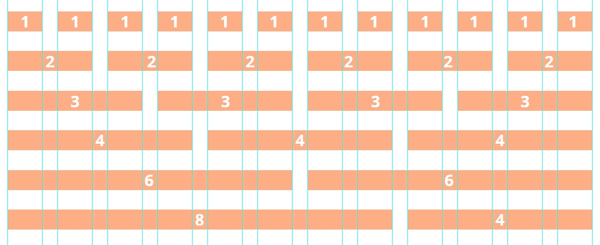
Bootstrap grid system is used for designing page layout. It is very useful for responsive web designing. It offers 12 columns in a container. Using grid you can divide a container in various way.
The following figure describes the possible ways to divide a container using Bootstrap grid system:

There are four classes of Bootstrap grid system:
- xs (for phones)
- sm (for tablets)
- md (for desktops)
- lg (for large desktop)
Basic Structure of Grid System
Example:
<div class="row">
<div class="col-*-*"> </div>
<div class="col-*-*"> </div>
</div>
<div class="row">
<div class="col-*-*"> </div>
<div class="col-*-*"> </div>
<div class="col-*-*"> </div>
</div>
</div>
Note: For a row you can add desired number of column but the number must be always add up to 12 for each row.
Examples Using Grid System
Here is a most basic example using grid system which gives a single column:
Example:
<div class="row">
<div class="col-md-12"> Content inside the grid </div>
</div>
</div>
Run Example
Here is an example using grid system which gives two equal column:
Example:
<div class="row">
<div class="col-md-6"> Content1 inside the grid </div>
<div class="col-md-6"> Content2 inside the grid </div>
</div>
</div>
Run Example
Here is an example using grid system which gives two unequal column:
Example:
<div class="row">
<div class="col-md-4"> Content1 inside the grid </div>
<div class="col-md-8"> Content2 inside the grid </div>
</div>
</div>
Run Example
Here is an example using grid system which gives three equal column:
Example:
<div class="row">
<div class="col-md-4"> Content1 inside the grid </div>
<div class="col-md-4"> Content2 inside the grid </div>
<div class="col-md-4"> Content3 inside the grid </div>
</div>
</div>
Run Example
Here is an example using grid system which gives various sizes column:
Example:
<div class="row">
<div class="col-md-1"> Content1 inside the grid </div>
<div class="col-md-2"> Content2 inside the grid </div>
<div class="col-md-4"> Content3 inside the grid </div>
<div class="col-md-4"> Content4 inside the grid </div>
</div>
</div>
Run Example